AGP Report for Diabetes: A Visual Walkthrough
Learn how to read an AGP report diabetes summary visually, including median lines, percentile bands, time in range, and how to discuss it with your care.

In this article(14)
An AGP report for diabetes compresses weeks of CGM data into a single visual snapshot that reveals patterns your daily glucose numbers hide. Once you know how to read the curves, bands, and targets on the report, your conversations with your care team become far more productive.
If you wear a continuous glucose monitor and have ever opened the summary PDF only to feel slightly confused by the wavy graph and stack of percentages, you are not alone. The AGP report diabetes summary is dense on purpose. It packs two weeks of glucose readings into one image because patterns are easier to spot when the noise of any single day is averaged away.
This walkthrough covers what each part of the report shows, how to interpret the bands and metrics, and how to bring the report into a productive appointment. We will move through it the same way most clinicians do, from the top of the page down.
What Is an AGP Report
The Ambulatory Glucose Profile, or AGP, is a standardized one-page summary of CGM data. It was developed by the International Diabetes Center to give clinicians, researchers, and people with diabetes a consistent way to look at glucose data regardless of which CGM brand collected it. The report typically covers the most recent 14 days of readings, which the Battelino et al. 2019 consensus in Diabetes Care identified as the minimum window for a clinically meaningful pattern.
The AGP layout has three main zones. The top of the page shows summary statistics including average glucose, Glucose Management Indicator, and time in range percentages. The middle holds the AGP curve itself, which is the visual heart of the report. The bottom usually shows daily glucose plots so you can sanity-check the averaged picture against individual days.
You will see this same general layout whether you generate the report from Dexcom Clarity, Abbott LibreView, or your clinic's data platform. The standardization is the point. A care team that sees AGP reports from many patients can read yours quickly because the format never changes.
Why Clinicians Rely on the AGP Format
Before AGP became the norm, every CGM company produced its own report style and clinicians had to relearn each one. That slowed appointments and made comparisons between visits messy. The AGP format solved this by setting a single visual grammar for glucose data, which is why the American Diabetes Association Standards of Care now references AGP metrics directly when discussing CGM use.
For you as a person with diabetes, the value is simple. When you understand the report once, you understand it forever, and the same skills work no matter which device you wear next.
How to Read an AGP Report Diabetes Summary
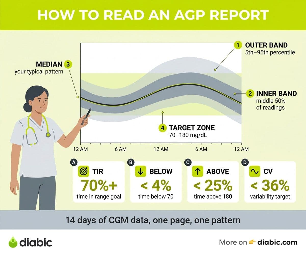
The middle of the report, the AGP curve, looks like a stacked set of bands wrapped around a central line. That single image represents 14 days of data folded into a 24-hour view, so you can see what your glucose tends to do at, say, 7 a.m. or 10 p.m. across all those days at once.
The dark line through the middle is the median, also called the 50th percentile. Half of your readings at any given clock time fall above this line and half fall below. Think of it as your "typical" glucose pattern. If the median sits high during the morning hours, that is your usual breakfast story.
The shaded band closest to the median is the interquartile range, covering the 25th to 75th percentiles. Most of your readings, the middle 50%, fall inside this band. A narrow band means your glucose behaves consistently at that hour. A wide band means your glucose at that time of day swings unpredictably from day to day.
Reading the Outer Bands and Target Zone
The lighter outer bands stretch from the 5th to the 95th percentile. These show you the full spread of your readings, including the unusual highs and lows. When the outer band balloons high in the early evening, for example, that is telling you that on a meaningful number of days, your dinner pushes glucose well above target.
A horizontal shaded zone runs across the chart between 70 and 180 mg/dL. That is the standard target range for most adults with diabetes, and your goal is for the median and as much of the bands as possible to live inside it. The time in range explained post breaks down why this specific range was chosen and how to think about it.
The horizontal axis runs from midnight to midnight. Reading left to right walks you through a typical day, so you can ask, "What does my glucose do overnight, at breakfast, after lunch, and in the evening?" That single question, paired with the curve, surfaces patterns that get lost when you scroll through individual readings.
Understanding Your Time in Range and Key Metrics
Above or beside the AGP curve, you will see a colored bar or stacked metric panel. This is your time-in-range breakdown, and the targets come from the international TIR consensus published in Diabetes Care.
The headline numbers most clinicians glance at first are these. Time in range, glucose between 70 and 180 mg/dL, with a target of 70% or more. Time below range, under 70 mg/dL, with a target of less than 4%. Time below 54 mg/dL, the danger zone, with a target of less than 1%. Time above range, over 180 mg/dL, with a target of less than 25%.
These targets are not arbitrary. They come from analysis showing that hitting 70% time in range correlates with an estimated A1C around 7%, and the Beck et al. JAMA 2019 analysis linked TIR improvements to reduced retinopathy risk. So when your AGP shows 65% time in range, you are five percentage points away from a meaningful clinical threshold, not just a round number.
GMI, CV, and What They Add
Two other metrics deserve attention. Glucose Management Indicator, or GMI, is an estimated A1C calculated from your CGM average. It often differs from your lab A1C by a few tenths of a point, and that gap is information rather than a problem. A GMI noticeably lower than your lab A1C, for example, can hint at high glucose variability that the A1C blood test is picking up differently than the CGM average.
Coefficient of variation, or CV, is the AGP's variability metric. The consensus target is below 36%, and a higher number tells you your glucose swings more than is ideal. CV pairs nicely with the visual width of the bands. Wide bands and a high CV are saying the same thing in two different ways.
You will also see your current estimated A1C normal range reference on many reports, often shown beside the GMI for context. Looking at GMI, lab A1C, and TIR together gives a fuller picture than any single number alone.
Reading an AGP Report Diabetes Curve for Actionable Patterns
Once the metrics are familiar, the curve itself starts telling stories. Most patterns fall into a handful of recurring shapes, and learning to spot them speeds up your problem-solving.
A median line that climbs steadily between roughly 3 a.m. and 7 a.m. is the classic signature of the dawn phenomenon, where overnight hormones nudge glucose upward. A dip below the target zone in the early morning hours, especially if the band widens downward, suggests nocturnal lows worth discussing with your provider.
Post-meal spikes show up as sharp humps that rise about 60 to 90 minutes after typical meal times. If your breakfast hump is far higher than your lunch hump, the AGP is telling you breakfast is the meal to focus on first. That kind of targeted insight is exactly what the report is built to surface.
Wide Bands Versus Narrow Bands
Pay attention to band width across the day. Narrow bands mean your glucose behaves similarly at that hour every day. Wide bands mean it does very different things on different days. Narrow bands at high values are still a problem, but they are a predictable problem you can usually solve with a single change. Wide bands point to inconsistency in food, timing, dosing, or stress, and they often need a different kind of solution.
From my experience: I have lived with type 1 diabetes for 14 years and worn CGMs for most of the last decade. The first time my endocrinologist walked me through an AGP report, the band width discussion changed how I thought about my data. My average looked fine, but the 5 p.m. to 8 p.m. band was huge. We traced it to inconsistent dinner timing rather than the food itself, and a small routine change tightened that section more than any insulin tweak had managed.
Days-of-the-week comparisons can also be revealing. Many CGM platforms let you toggle between weekday and weekend views inside the same AGP layout. If your weekend bands sprawl while weekday bands stay neat, that is your AGP telling you that schedule matters.
Using Your AGP Report With Your Healthcare Team
The AGP report is most useful when it becomes a shared object you and your care team look at together. Generating it ahead of your appointment, rather than relying on the office to pull it on the day, gives you time to notice patterns yourself and arrive with questions.
In Dexcom Clarity, you can find the AGP under the "Reports" tab and download a PDF for the time window you choose. In LibreView, the AGP is in the "Glucose Reports" section. If you use a CGM app day to day, the report often lives one or two taps deeper in the menu, and the company's help center is usually the fastest way to find it the first time.
When your provider opens your AGP, they typically scan in this order. Time in range first, to see the headline summary. Time below range second, because lows are an immediate safety concern. Then they look at the curve to identify which time-of-day patterns are dragging the numbers in either direction.
Questions Worth Asking
Bringing two or three specific questions tied to the report turns a 15-minute visit into a working session. A few that tend to be productive are these. "My median climbs sharply after breakfast, what would you change first?" "My overnight band dips low between 2 and 4 a.m., does my basal need adjusting?" "My CV is 42%, what would you focus on to bring it down?"
Setting a goal for the next visit can also help. Rather than aiming at "a better A1C," try "increase TIR from 62% to 68% over the next three months" or "reduce time below range from 6% to under 4%." These are AGP-native goals, easy to measure, and easy to act on.
FAQ
How do you read an AGP report for diabetes?
Start at the top with your time in range, time below range, and GMI numbers. Then look at the AGP curve in the middle, where the dark line is your median glucose by time of day, the inner band shows where most of your readings fall, and the outer band shows your full spread. Anywhere the median or bands push outside the 70 to 180 mg/dL target zone is a pattern worth investigating with your care team.
What does an AGP report show about my blood sugar?
The AGP report shows what your glucose typically does across a 24-hour day, averaged over 14 days of CGM readings. It surfaces patterns like dawn phenomenon, post-meal spikes, overnight lows, and day-to-day variability that are hard to see when you scroll through individual readings. It also summarizes your time in range, average glucose, GMI, and coefficient of variation in a single view.
How often should you review your AGP report?
For most people with diabetes, a brief weekly look at your AGP can help you catch patterns early, with a more thorough review every two to four weeks. Bring the most recent 14-day report to every appointment with your endocrinologist or diabetes educator. If you change medications, start a new exercise routine, or have a major life shift, reviewing the report two weeks later may help you and your provider see the impact.
The AGP report diabetes summary becomes far less intimidating once you know what each piece is doing. Spend a few minutes on your next report walking through the median, the bands, and the metrics in order, and consider talking to your doctor about anything that surprises you. Research suggests that people who engage regularly with their CGM data tend to see steadier glucose patterns over time, and the AGP is the simplest place to start.
Shahriar P. Shuvo is the founder of Diabic. He has lived with diabetes for over 14 years, and built Diabic to deliver the practical, evidence-based self-management tools he wished existed when he was first diagnosed. By trade, Shahriar is a senior design and frontend engineer with 6+ years shipping products at Agora, Timescale (now Tiger Data), and ShareTrip. He writes from the intersection of lived diabetes experience and product craft, focused on what works in daily management rather than what sounds good in a textbook.
Medically reviewed by
Dr. Rezwana Parvin Rumpa is an obstetrics and gynaecology specialist with clinical focus on gestational diabetes, PCOS, and fertility. She holds the MRCOG (Final Part) from the Royal College of Obstetricians and Gynaecologists in London, the MRCPI (Final Part) from the Royal College of Physicians of Ireland, and an MBBS from Shaheed Monsur Ali Medical College under Dhaka University. Dr. Rumpa serves as a Senior Medical Officer in the Obs and Gynae department at BRB Hospitals Ltd, where she has spent three years managing prenatal care, emergency obstetric cases, and women's-health surgery. On Diabic, she medically reviews content for women living with diabetes, with particular attention to pregnancy, PCOS, and reproductive-health intersections.
More from Devices & Technology
View all
Fasting vs Postprandial Glucose: What's the Difference
Fasting vs postprandial glucose readings tell different stories about your blood sugar. Learn what each number means and how to act on it.

Best Glucometer for Elderly and Low-Vision Users
Best glucometer for elderly and low-vision users: large displays, audio readouts, no-coding strips, and budget picks that make daily testing easier.

Online Diabetes Coaching: How to Choose a Good One
Online diabetes coaching can fill the gaps between doctor visits. Learn what credentials to check, red flags to avoid, and how to pick a quality program.
Clinician-reviewed habits, plain-language guides, and honest answers - the small shifts that make living with diabetes feel lighter, every day.